

Sides of a marketplace
Customer ordering and florist supply designed as one system.
Bloomprint case study
A national flower delivery marketplace where the customer describes what they want and an independent local florist designs it. Customer ordering, florist supply and organic growth built as one product.
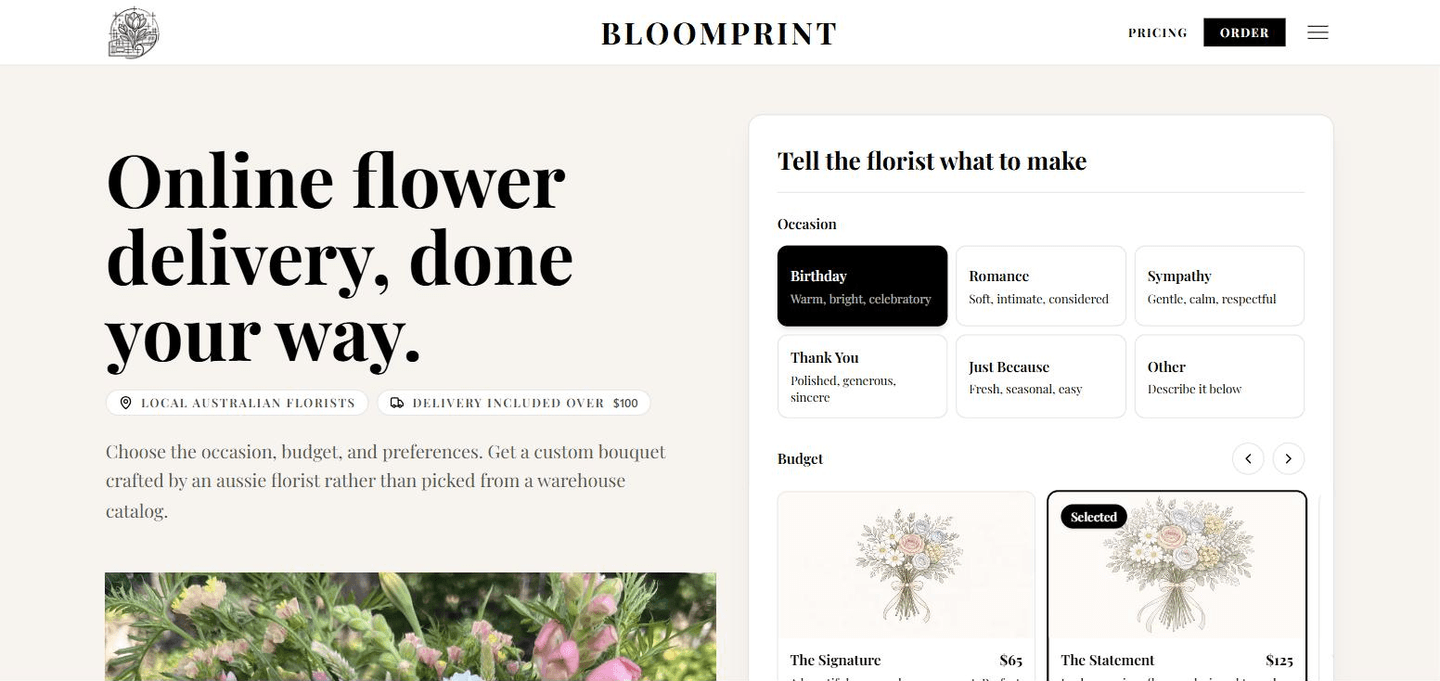
What this case study covers
01 / The brief
Online flower delivery usually means scrolling near-identical warehouse bouquets and hoping the photo resembles what turns up. Bloomprint works the other way around: the customer sets the occasion, the budget and their preferences, and an independent florist near the recipient designs to that brief from what is fresh that day.
That is a harder website. It needs an ordering experience that captures intent instead of a product ID, a supply-side product that convinces working florists to sign up, and enough of a search presence to sell a name nobody is looking up yet.
Customer ordering and florist supply designed as one system.
Perth, Sydney, Melbourne, Brisbane, Adelaide and Hobart.
City, occasion, subscription and guide pages feeding one order engine.
02 / The experience
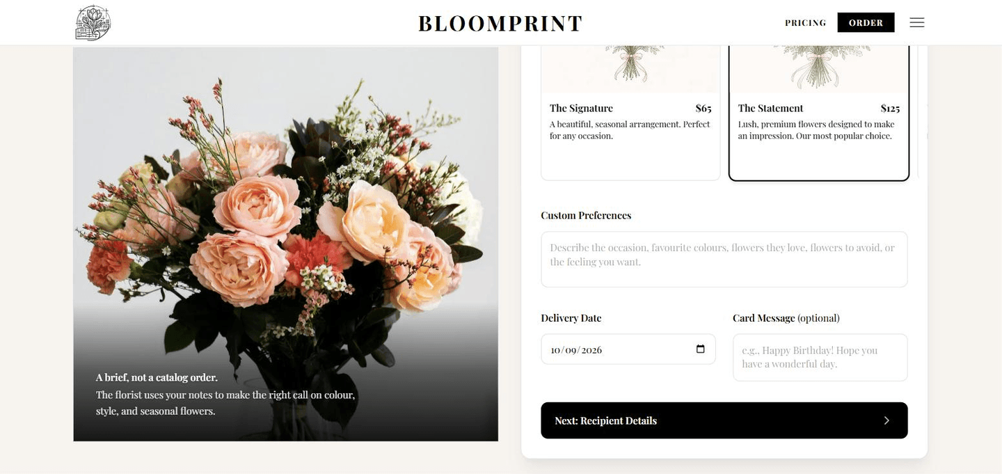
03 / Every screen
Flower orders often begin on a phone, so the brief, budget, delivery details and payment path were designed for the smallest screen first. The mobile journey is the product—not a compressed desktop checkout.
04 / Both sides
A customer journey that ends in a beautiful order is worthless if no florist wants to make it. Both sides were designed together, so what the customer is asked for is exactly what the florist needs to start work.
Describes the outcome and pays once—no catalogue, no surprises at checkout.
Gets paid work near the shop with the creative freedom to design it properly.
05 / Pricing as a product decision
Most flower sites reveal the real price at checkout. Here the customer names the amount—a tier or any custom figure—and that is what they pay, with delivery included over $100. It removes the biggest reason gift buyers abandon an order, and it gives the florist a firm number to design against.
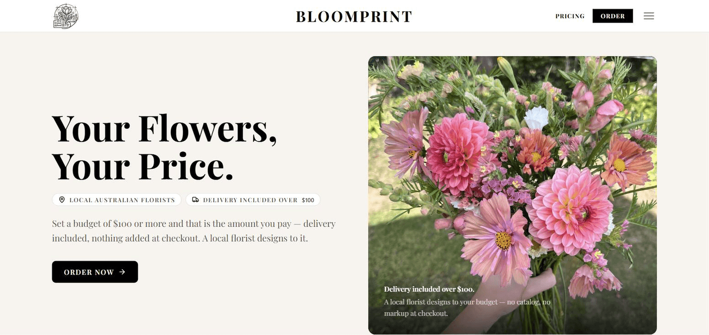
06 / Built to be found
Nobody searches for a marketplace that launched last month. They search for flower delivery in their city, for a subscription, for Mother’s Day, or for a comparison of who is actually any good. The content and landing page structure was built around those searches from the first sprint, not bolted on later.
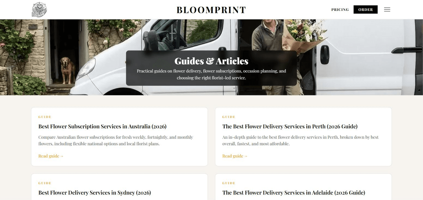
07 / Front doors
Each page speaks to a different search, then hands the visitor the same order builder—already framed around their city, their occasion or the way they want flowers to arrive. New front doors can be added without rebuilding the thing behind them.
08 / SEO growth
Organic clicks grew 68% in three months. City, occasion and guide pages gave a new brand more ways to meet customers already searching for flower delivery.
Ranked by impact and cost.
What each change earned.
23 checks: pass, warn or fail.
Where your search traffic is heading.
09 / Common questions
Yes. We reuse the thinking and proven patterns, not another business's design. Your website or system is scoped around your customers, operations and commercial goals.
No. A website URL and a plain-English explanation of what is taking too much time or not working well are enough to start.
Usually. We can connect websites with CRMs, inventory systems, email tools, payment platforms and other software where suitable integration options are available.
It depends on the customer journeys, operational tools and integrations involved. We define the smallest worthwhile first release and provide a clear scope before development begins.
Start with the busywork
Tell us what gets copied, chased or checked each week. We'll help you find the simplest worthwhile place to begin.